 Korean Sea Pine at the Spirited Garden in Jeju Island, South Korea Having just returned from South Korea and Japan, I have been asked what inspired me the most from our trip. You may find it surprising given all the gorgeous temples, vibrant city architecture, and beautiful people that I found one of my greatest inspirations in a garden on Jeju Island. When we were informed by our tour guide that we would be visiting a garden, I gave it little thought. After all, I've had the good fortune to see some truly magnificent gardens. I had looked forward to it, but I had no clue how this location would affect me. As it turns out, we were visiting The Spirited Garden. A world famous site that was started in 1968 by one man with a vision.  The sculptural quality of this dead tree is beautiful at the Spirited Garden Bum Young Sun was 29 when he decided to make a garden out of a desolate area of scrub and volcanic stone. I was moved to tears by the masterpiece of tranquility and beauty that he crafted with his own hands. While walking around some 400 trees, mostly bonsai (known as bunjae in Korean), I was captivated by the twisting branches and the sense of calm that swept over me. I kept thinking that I wish that I could meet the creator of this wonderland so that I could express my gratitude. As if by magic, this elderly man appeared. I was astonished to see Bum Young Sun tending to one of his beloved trees while donning his distinctive tattered straw sun hat. Although I didn't want to disturb him, he appeared to be just as intrigued by me as I was by him. 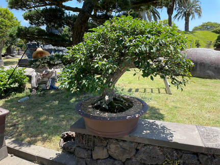 You may see Bum Young Sun in the distance lovingly caring for his trees You see, he enjoys having guests from all around the world visit his garden. I didn't want to break his concentration. The garden has a meditative quality and he looked as if he was in deep thought. But as I passed, he turned to face me and looked at me with the gentlest eyes, and greeted me. After asking me where I was from, he seemed pleased with my response. He thanked me after I expressed my gratitude for his garden. In fact, we thanked one another repeatedly. It was a wonderful encounter that I didn't expect and for which I am truly grateful. 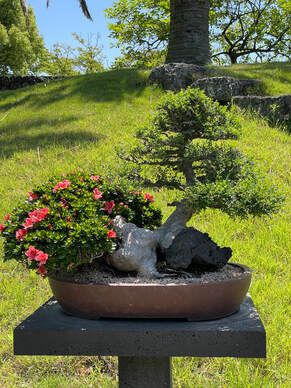 A beautiful combination of an azalea and evergreen Future paintings will undoubtedly feature some of his trees prominently. In fact, I'm already thinking about a series. The thing that most impressed me, though, was the commitment that this one modest man had to producing something of incredible beauty to be shared with the world. What was the last thing that truly inspired you? Let me know in the comments. I'd love to know about it.
4 Comments
 Just Below the Surface, 12"x12," acrylic on panel, © Lynn Goldstein $550. See more about this painting here We were staying up late into the night, probably knowing that the morning would come all that much sooner if we went to sleep. You see, my son was leaving for college the next day, and both of us were feeling anxious about the changes that were coming our way. To quell his concerns, he asked me all kinds of questions. One question was easy for me to answer. "Mom, what was your least favorite thing about college?" I hated critiques. What in the world changed for me? First, let me explain. Critiques were brutal when I was in college. My professors didn't seem to understand the concept of constructive criticism. In retrospect, perhaps they were trying to toughen us up, or maybe trying to weed us out of the program. If I had let them, they would have crushed my spirit into the ground. Instead, I vowed that should I ever teach, I would not emulate them, and I never have! When I critique other artist's work, I first make an effort to understand what that person is trying to say with their art, and we go from there. I approach any critique based on where each artist is in their journey, and find areas that can improve the work quickly. In other words, I critique in the way that I prefer receiving help with my own work. Good critiques have improved my work ten-fold. Good critiques are one of the best ways to improve your art. Here are 6 reasons why: 1. Making art is a solitary endeavor. We can get stuck in our own heads. Showing our work to others can help us to see our work differently. 2. Fresh eyes bring fresh perspective. 3. Someone who is good at critiquing work can help guide us by showing us work by others that may have a similar aesthetic. We can then study that work to improve our own. 4. Someone who understands the principles of strong art can help us to improve important aspects of our work. 5. If in a group, we can see how our work is perceived by others, and practice talking about our work as a result of looking at it more closely. Others may find aspects of our work that was never considered. 6. We can also see how other artists solve problems and potentially borrow those solutions in our own work. Here's what students have said about my critiques: She has taught me so much, including how to develop good composition and a focal point, but, above all, she has given me confidence in my own abilities. ~L. Miller I have taken classes with other art instructors so have experienced a variety of styles and personalities. Some have not offered any specific content, so I felt I wasn't learning anything. Other teachers have been talented themselves but impatient with students' lack of expertise and therefore extremely harsh in their criticism. In contrast, Lynn offers an upbeat, positive approach which encourages students to work at their level and to stretch themselves as they are ready. ~M. Norman My online critique group will be starting on Tuesday, February 1, and I would love to have you join us.
There are only 2 spaces left! Want to join us? Click the button below.  A Strong Balance, 12"x12," Acrylic on panel, ©Lynn Goldstein, buying information here. There is a reason that the expression, working outside your comfort zone, makes you feel challenged, and maybe a little uncomfortable. However, there are compelling reasons to take a break from what is safe in life, and also in your art-making practice. Here are simple ways to jump-start your creativity by doing something new. 1. Change it up and feel more alive. The same-old-same-old that we have all faced during this pandemic has been tough on us all. If we take the time to consider how we can alter our everyday routine, we will inevitably feel more excited, and creativity will be sparked from the experience. As an example, if you usually walk around your neighborhood, you may want to go to a local park to see something new to you. I know that when I make an alteration as simple as that, the difference in the landscape is enough to inspire and uplift me. Here are some pics from a recent walk. Something as simple as the change of seasons can inspire. 2. Use colors that you don't usually use in your art. I tend to use a similar palette of colors frequently. It was time to shake things up a bit. So, I made the painting that you see above. I didn't even put paint colors that I usually use out on my palette. Didn't want to have any temptation to slip back into my comfort zone. It felt weird, to say the least, but I am very happy with the end result. It's so different from the colors that I ordinarily embrace, and using these colors made me think differently, and I had a great time doing it. Not an artist? Well, you could try to wear a color that you rarely would wear. Not a big commitment if it's only a scarf or gloves.  This piece, "We've Got Rhythm," by Delna Dastur is on view at the "(Not) Strictly Painting" exhibition at the McLean Project for the Arts until November 13. If you are in the Washington, DC area it's well worth a visit to the gallery to see this show! 3. Look at artwork by artists with whom you are unfamiliar. We tend to become comfortable with artists whose work we have seen repeatedly. I am thinking of work by Van Gogh and Monet as examples of artists whose work have been seen over and over again . The next time you are fortunate enough to visit a museum or gallery, take a closer look at work that is different. Jot down the name of the artist and look at more of their art online. This will enrich your life and could inform your art work in ways that surprise and delight you.
Do you challenge yourself to do different things in your life and art? I'd love to hear about it. Let me know in the comments below.  Fleeting Memory, 12"x12," Acrylic on Panel, ©Lynn Goldstein, click here to see more information on this painting. ,Entering juried exhibitions can be time-consuming and expensive.
I rarely enter these art shows, but once in a great while a show interests me, and I jump in. If you are considering entering a juried art exhibition, my advice is to think long and hard before committing. Understand the pros and cons, and what you may get out of the experience prior to making the leap. Be sure to research the judge. If you are not impressed with the judge's credentials, hold off. Here are five reasons that I may choose to enter a juried show. If you enter juried exhibitions, let me know the reasons you do so in the comments below. I'd love to hear from you. 1. I know that by being accepted, I may become a signature member of an art organization to which I want to belong. This was the case when I was accepted into three national juried exhibitions hosted by the Pastel Society of America. As a result of those acceptances, I am now a signature member of that illustrious group. I wanted the signature designation because I enjoy teaching. This honor helps potential students know that I am serious about the work that I do and have been accepted by peers. 2. I want a different audience to view my work. This may be online or in person. In either case, try to ascertain how many people may see your work. If this is a reason to enter a show, be sure that the organization sponsoring the show does a good job advertising and marketing? If not, reconsider entering. 3. I want my work to come to the attention of the curator of the show. This is self-explanatory. 4. The show is in a prestigious location as when I exhibited my work at the Smithsonian in 2015 and 2017. See that work here and here. 5. I am exploring a new style of work and I want confirmation that my direction is sound. 6. There are hefty prize incentives. I have been fortunate to be awarded some amazing prizes, and that is always welcome. Sometimes the prizes are art supplies and sometimes the prize is strictly monetary. Since I have been working on a new series, I was interested in seeing how it would be received. So, I decided to enter the Art2Life International Juried Exhibition. To my surprise and delight, my work was accepted. I knew that this would be a very competitive show. As it turns out, there were approximately 4,500 pieces of art entered and only 50 selected. Perhaps if I had known those odds, I wouldn't have entered, but I am surely glad that I did!  Among the Grasses, 30"x30," Oil on panel, ©Lynn Goldstein, more info here Sometimes a painting is completed in what feels like minutes. The art seems to simply drip off my brushes almost fully formed. When this happens I feel as if I have been handed a gift from the gods. More often, a painting takes bloody forever, which makes me wonder how I ever thought that I could do this thing called art-making. The piece may sit for days, weeks, and months before I bring it to the finish line. The painting above is an example of a painting that took forever, and went through many iterations. Check out the way it used to look before I altered it below. What does this have to do with advice from Smokey Robinson? Read on.... My love of music led me to a terrific book entitled, Smokey Robinson: Grateful and Blessed, narrated by the great songwriter himself. What joyful listening! I highly recommend it. I was riveted hearing Mr. Robinson discuss his creative process, and was particularly interested when he said that it took five years to come up with the lyrics for Cruisin,' while it took five minutes to write the words to Shop Around. Hearing this, I realized that if someone as creative and impressive as Smokey Robinson can take his time writing the words to a song, then, by golly, I will simply embrace the time that it takes for me to complete a painting no matter how long the process lasts! So, the advice I received from Smokey Robinson? He didn't say this, but I am going to extrapolate from his experience to relax into the process and enjoy the ride. Hope this helps you if you are a fellow artist. If you are not an artist, I hope what I have written helps you to understand part of the creative process.  Among the Grasses, progress being made. I kept looking at this in a thumbnail view and I didn't like the tree on the right. Changes had to be made. 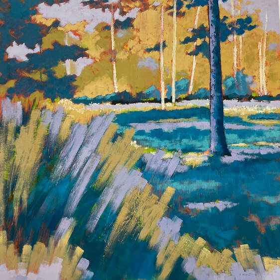 Among the Grasses before I made changes
 Go Bold, 12"x12," oil on panel, © Lynn Goldstein, $600 see more about this piece here. While having a conversation with one of my closest friends, she mentioned that she never had one of those amazing teachers that impacted and inspired her throughout her life. That got me thinking. Did I have an inspiring teacher? The answer is yes, I did. I had a few of them. One was Mr. Rose, my dance instructor for eight years. He taught me the joy and artistry of movement, something that was apparently hardwired into my DNA. I loved the discipline of ballet, and I bring that training into my art-making practice to this day. I had another dance instructor during my years in college. Unfortunately, I can't recall his name, but I remember something that he said to me as if it were yesterday. I try my best to bring his words to the forefront of my mind when I am experimenting with my art, and making what seems like a colossal mess. Here's what he had to say: When you are dancing and you make a mistake, you tend to make a face that broadcasts your error. Don't do that. Just keep on dancing. The audience will never know." Lately, I have been experimenting in my work. I have been using acrylic, working on abstracts, and making lots of mistakes. Mistakes are a great way to learn. I am not making any negative faces anymore either, and I am continuing to keep on dancing. Well, at least my brushes are dancing.... So, if you are also making mistakes, simply keep on dancing! You will learn a lot, you will grow, and the audience will never know. Do you have any great words of wisdom from an inspirational teacher? Would you be willing to share? I would love to read them in the comments below.  The Soul Knows, 12"x12," Acrylic on panel, © Lynn Goldstein, $600
This painting is one of the abstract pieces that I have been working on in acrylic. I love this one!  Abundance, 10"x20," Oil and cold wax on cradle panel, ©Lynn Goldstein, private collection Isn't it difficult to sell your art after working so hard on it? This is a question that I have been asked so many times over the years, and my answer is always the same. I am happy to sell a painting because my mission in life is to uplift others, and sharing my work can do just that. However, something occurred that challenged my usual response to the question recently. I got a notification in my email inbox that one of my paintings had sold. After the initial thrill, I realized which piece it was. For the first time that I can remember, I exclaimed out loud (with no one in the room), "Oh NO!" Clearly, I didn't know that I was more attached to this particular painting than I had thought. But the universe had a better plan for that painting than for me to hold on to it. A fact that became abundantly clear the following day when I received another email. See below:  Abundance in process on my easel The email came from the buyer of the painting in question and it brought tears to my eyes. I am sharing a shortened version of her email here (in red):
I was diagnosed with stage 4 cancer last fall and have been undergoing chemotherapy since then. When I was first diagnosed, I went around my house pulling pictures off the wall that no longer inspired me (it was like some sort of obsessive 'nesting' thing). And I went into the attic and brought down pieces I had acquired early on and other ones with lots of color. And that was about the time I got your first piece as I found the vibrancy and colors to be just what I needed. I wanted to be surrounded by old friends, energy, and beauty. The night before last had been a bit rough, and when I saw your painting it just lifted my spirits. It was perfect timing. Just wanted to let you know how much I appreciate your work and that you never know how much of an impact it can have.... I can't say how grateful I am that this painting is where it truly needs to be. Art can heal, and we are all enriched to have art in our lives. Do you have a story about how art has enhanced your life? I would love to hear from you in the comments below.  Illuminated, 20"x20," oil on canvas, ©Lynn Goldstein, private collection One of the paintings submitted for peer review by Washington Society of Landscape Painters See the other pieces submitted below. Guess what? I just found out that I’ve been accepted into the Washington Society of Landscape Painters (WSLP). Getting an acceptance into this group has been a goal of mine for years. Yay! Yay! Yay!
This is a big deal. Why? Read on....
 Undulations, 11"x14," Oil on panel, ©Lynn Goldstein, private collection Oil painting was my first love in college.
After graduation, I continued working in oil for several years. However, I switched over to soft pastels to avoid the solvents required to work in oil necessary at the time. Many years later, I tried oils again, utilizing odor-free mineral spirits. I wasn't able to rid myself of the concern that I was still breathing the fumes, I just couldn't smell them. Furthermore, I hated washing my brushes. It was so difficult to get the paint out of the bristles. I found myself thinking about the fact that after each painting session, I would have to wash the darned brushes. That alone was sapping the joy from my painting experience. I kept hearing about water-mixable oils, and I decided to give them a try. Now that I have found my favorite brand, I am hooked. The color is vibrant, I don't have to use solvents, and I can clean my 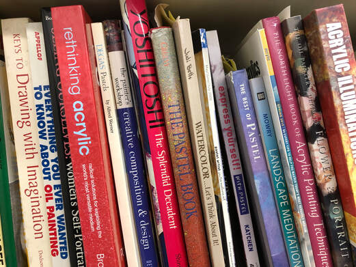 A shelf in my studio outside my home I own an embarrassing amount of art books. They take up space all over my house, in my studio outside my home, and I love them. However, I have some all-time faves. These are the books that always seem to find their way into my hands. They move from my studio outside my home, back to my home with regularity, and from room-to-room frequently. To find out what they are, and why I consider them some of the best out there, check out this video. |

|